
Introduction to ggplot
This post will give you a quick introduction to a great way of plotting using R: the ggplot2 package (which for simplicity I will call ggplot from now on). ggplot is an R package which makes it super-easy to create visually pleasing plots with just a few lines of code! Behind it lies a complex philosophy of visualisation, created by Hadley Wickham in 2005, based on the theory developed by the statistician and computer scientist Leland Wilkinson in his 1999 book “The grammar of graphics”.
If you have never used ggplot, you will first have to install it. This needs to be done only once, using
install.packages("ggplot2")Once that is done (it may take a little while), every time you want to use it, you can load the package using
library(ggplot2)Aesthetics and geometries
The philosophy behind ggplot is that each plot is made out of layers that you can manipulate individually. The main function you are going to use for generating plots is ggplot.
But, first of all, let’s load up some data! I am going to use a hypothetical dataset containing blood levels of a metabolite in the blood of patients.
metab <- read.csv("metab.csv")Let’s start by having a quick look at the data, using the head and summary functions.
head(metab) Concentration Sex Age Treatment
1 550.7 F 79 CTRL
2 260.7 M 41 A
3 450.8 F 64 CTRL
4 324.4 F 52 CTRL
5 228.7 M 43 B
6 325.1 M 53 Asummary(metab) Concentration Sex Age Treatment
Min. :118.1 F:215 Min. :35.00 A :150
1st Qu.:287.3 M:214 1st Qu.:45.00 B : 80
Median :373.8 Median :58.00 CTRL:199
Mean :386.8 Mean :56.92
3rd Qu.:466.8 3rd Qu.:68.00
Max. :862.5 Max. :80.00 We can now pass the dataset, and define the aesthetics that map the data to visual aspects of the plot.
ggplot(data = metab, aes(x = Treatment,
                         y = Concentration))
But. . . wait a moment, there is nothing on the plot!
That is because we did not specify what type of plot we want. Let’s try again. . . this time asking for a boxplot.
This is done by using geometries, that are generated through the geom_... functions. In our case, we are going to use geom_boxplot. Because we want to add a new layer to our plot, we use + to add the boxplot. Easy, isn’t it?
ggplot(data = metab, aes(x = Treatment,
                         y = Concentration)) +
geom_boxplot()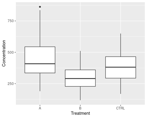
If you wanted to plot a histogram, instead, you could use geom_histogram
ggplot(data = metab, aes(x = Concentration)) +
geom_histogram(binwidth = 20)

# Alternatively, use bin to set the number of bins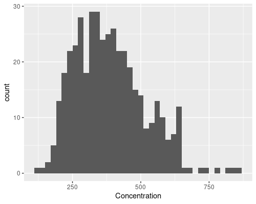
But, let’s say we want something more complicated, for instance adding some points over the boxplot, how do we go about it?
Very simple, we just add another layer using geom_point
ggplot(data = metab, aes(x = Treatment,
       y = Concentration)) +
# Avoid plotting outliers on the boxplot,
# since we are adding points on top
geom_boxplot(outlier.shape = NA) +
geom_point()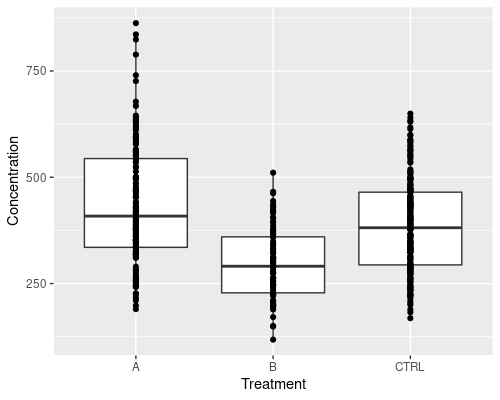
The plot above is not very readable, because points overlap too much. We can use geom_jitter to jitter the points and improve it. We also make the dots smaller using the size argument.
ggplot(data = metab, aes(x = Treatment,
                         y = Concentration)) +
geom_boxplot(outlier.shape = NA) +
geom_jitter(width = .1, size = 0.5)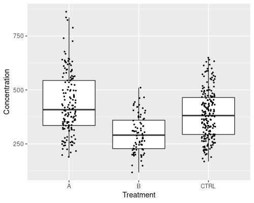
Mapping variables to aesthetics
This graphic is much improved, however it does not tell us which data points come from men and which from women. We can add a further aesthetic in geom_jitter, to specify the colour.
ggplot(data = metab, aes(x = Treatment,
                         y = Concentration)) +
geom_boxplot(outlier.shape = NA) +
geom_jitter(width = 0.1, aes(col = Sex), size = 0.5)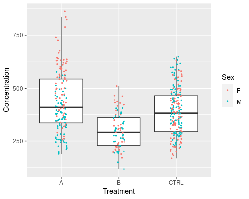
Note that ggplot automatically identifies Sex as a factor and colours it using a discrete scale. If we were to colour the points by a continuous variable, a continuous scale would be used. For example, we can try to do that with Age
ggplot(data = metab, aes(x = Treatment,
                         y = Concentration)) +
geom_boxplot(outlier.shape = NA) +
geom_jitter(width = 0.1, aes(col = Age), size = 0.5)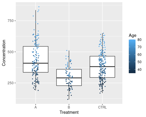
We can see a clear effect of age.
Custom scales
The colour scale can be easily changed, should you not like the default black to blue gradient. The scale_color_xxx functions will help you with that. For example with scale_color_gradient2 we can easily specify a “low-high” gradient; we can specify colours using their name, or their RGB components either in hexadecimal (as in this example) or in decimal using the rgb function.
ggplot(data = metab, aes(x = Treatment,
                         y = Concentration)) +
  geom_boxplot(outlier.shape = NA) +
  geom_jitter(width = 0.1, aes(col = Age), size = 0.5) +
  scale_color_gradient2(low = "#9d3b4a", mid = "beige",
         high = "#00426e", midpoint = 60)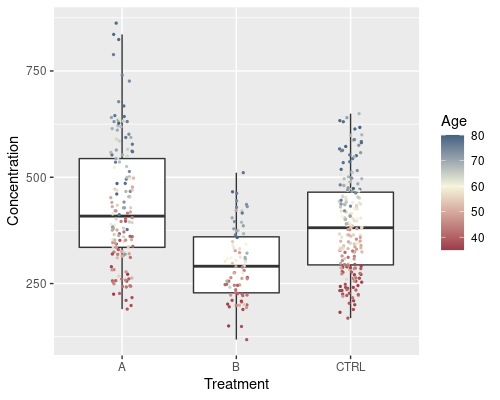
We can even go further and map Sex to the colour of the dots and Age to their size. I am using a custom discrete scale this time.
ggplot(data = metab, aes(x = Treatment,
                         y = Concentration)) +
  geom_boxplot(outlier.shape = NA) +
  geom_jitter(width = 0.1, aes(col = Sex, size = Age)) +
  scale_color_manual(values = c("navy", "orange"))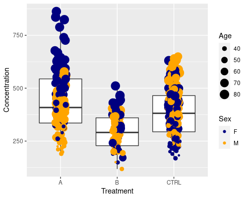
Similarly to what we did before, we can customise how big the dots should be by using scale_size_continuous
ggplot(data = metab, aes(x = Treatment,
                         y = Concentration)) +
  geom_boxplot(outlier.shape = NA) +
  geom_jitter(width = 0.1, aes(col = Sex, size = Age)) +
  scale_size_continuous(range = c(0.5, 2)) +
  scale_color_manual(values = c("navy", "orange"))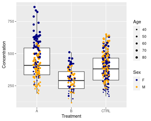
Faceting
The plot above is pretty, but it is still relatively complicated to clearly see M vs F differences. One way we could go about this is faceting, that is, splitting the plot into subplots
ggplot(data = metab, aes(x = Treatment,
                         y = Concentration)) +
geom_boxplot(outlier.shape = NA) +
geom_jitter(width = 0.1, size = 0.5) +
facet_grid(~Sex)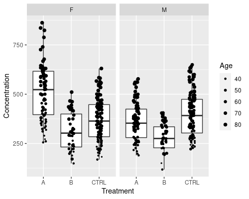
The ~Sex notation tells ggplot to split the plot by Sex.
This can also be used on multiple variables. Let’s create a new one, by dividing people into Young (<=60 years old), and Old (>60 years old)
metab$AgeCateg <- ifelse(metab$Age <= 60,
                         "Young", "Old")
ggplot(data = metab, aes(x = Treatment,
                         y = Concentration)) +
geom_boxplot(outlier.shape = NA) +
geom_jitter(width = 0.1, size = 0.5) +
facet_grid(AgeCateg~Sex)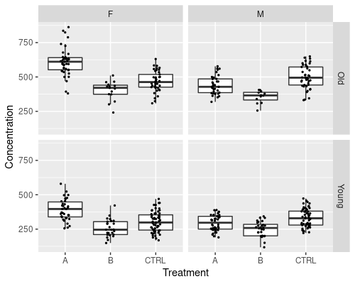
The faceting notation defines how the plot is split; by using var1 ~ var2 we will split by var1 in rows and var2 in columns. To split by one variable into columns we can use ~var1, while to split into rows var1~.
I will finish this post with a more complex graph, where we add a smoother to the data, for example, a linear regression
ggplot(data = metab, aes(x = Age, y = Concentration)) +
geom_point(aes(col = Sex), size = 0.8) +
geom_smooth(method = "lm")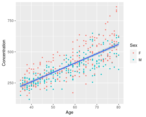
And, by just adding another aesthetic we can easily have a regression for men and one for women, and map age to size
ggplot(data = metab, aes(x = Age, y = Concentration)) +
  geom_point(aes(col = Sex, size = Age)) +
  geom_smooth(method = "lm", aes(col = Sex)) +
  scale_size_continuous(range = c(0.5, 2))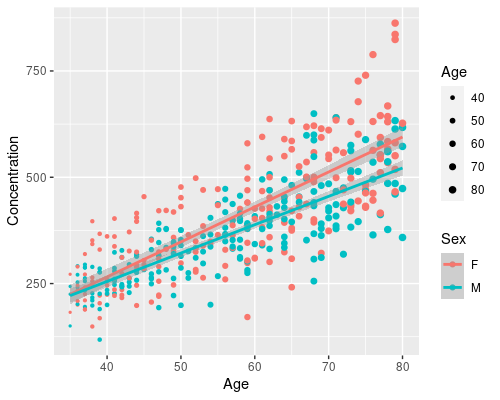
In a few lines of code, we have created a complex visualization using ggplot. From this we can clearly see that Age has a different effect on men and women. That is, there is an interaction between Age and Sex (don’t know what that is? Look at my post on interactions in linear models!)
Further reading
Hopefully, this has given you a quick taste of what you can do with ggplot. This is just the tip of the iceberg, though, and there is a lot more you can do!
The great book ggplot2: Elegant Graphics for Data Analysis is available for free and it is the go-to resource for this amazing package. Also, the ggplot2 cheat sheet by the folks at RStudio is a very handy resource!
Want some inspiration? Look at the R Graph Gallery or the ggplot2 extension gallery!
Happy plotting!